
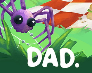
GMTK Jam: DAD
- Aug 19, 2021
- 6 min read
School's out, so now I have no structure or accountability to keep doing these, but I'll try anyhow. Rather than doing these by week, I will do a post per project. I have several planned; there's no chance I'll be able to do all of them and learn everything on my to-do list, especially because I'm super busy this summer.
From June 13-15, the 2021 GMTK game jam took place. The Studio GOMP gang has wanted to keep our momentum going through the summer. We all have busy schedules going forward, so this will probably be the final project we all work on together before the seniors move on to college. It was a nice sendoff though, because we finally got to work in person. It was nice to put faces to names, and to watch Monsters Vs. Aliens (obviously).
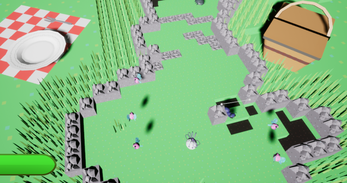
The theme of the jam was revealed to be "Joined Together". Our inciting idea was to take Katamari Damacy's idea of rolling around and picking up objects, but to have each object give the player new abilities to use in combat. The project lead wanted to present the game as a metroidvania. This, I think, was a mistake. Metroidvanias, by nature, require a certain scale that we didn't have the time to achieve. The one way in which a metroidvania sort of system (in which you need a certain ability to pass a point that you need to backtrack to acquire) was planned was in a dark area in which you would need a firefly to see. This didn't even pan out. For one reason or another, all bugs glow, so you don't need a firefly. Long story short, its mechanically flawed.
Nonetheless, we had fun playing it. It took a lot of trial and error (and advice from the programmers) to finish the game. There were a few close calls, but it took a while for anyone to beat the final boss. I eventually did though. Go me!
Now, the actual work blog part. During the announcement of the theme and the concepting of the game, the art director was out getting a drawing tablet. This left me (kinda (sorta)) as the acting art director for that time. We went through a few concepts for visuals. First, we considered featuring robots, but this felt a bit to similar to Techno Towers. Our second idea (which I quite liked) was to make everything themed to sweets, baking, and candies, starring a gummy bear. Still, we wanted to explore all the possibilities before settling. We ended up settling on bugs, but we didn't want it to be dark. Because of the prompt, I had my mind on Katamari Damacy. I really liked the look of the Reroll game, what with it's clean low-poly-and-low-res-textures look, so that's what I went with.
One of our three 3D artists was out of town, and the other served as project and design lead, which left me to do 90% of the 3D work. I was actually happy with this though, as I was able to keep much of it consistent to my vision without using that pesky "communication". It allowed me to set my own workflow which went as such:
I started by referencing the concepts made by our 2D artists. Side note: Because of the aforementioned tablet situation, two of the 2D artists kinda missed the memo on the visual direction. This resulted in some of the concepts being rounder and squishier than was appropriate, unfortunately. The few models I didn't make ended up looking out of place in the same way. While I wasn't the art director or lead, I really should've communicated this stuff better. Lesson learned.
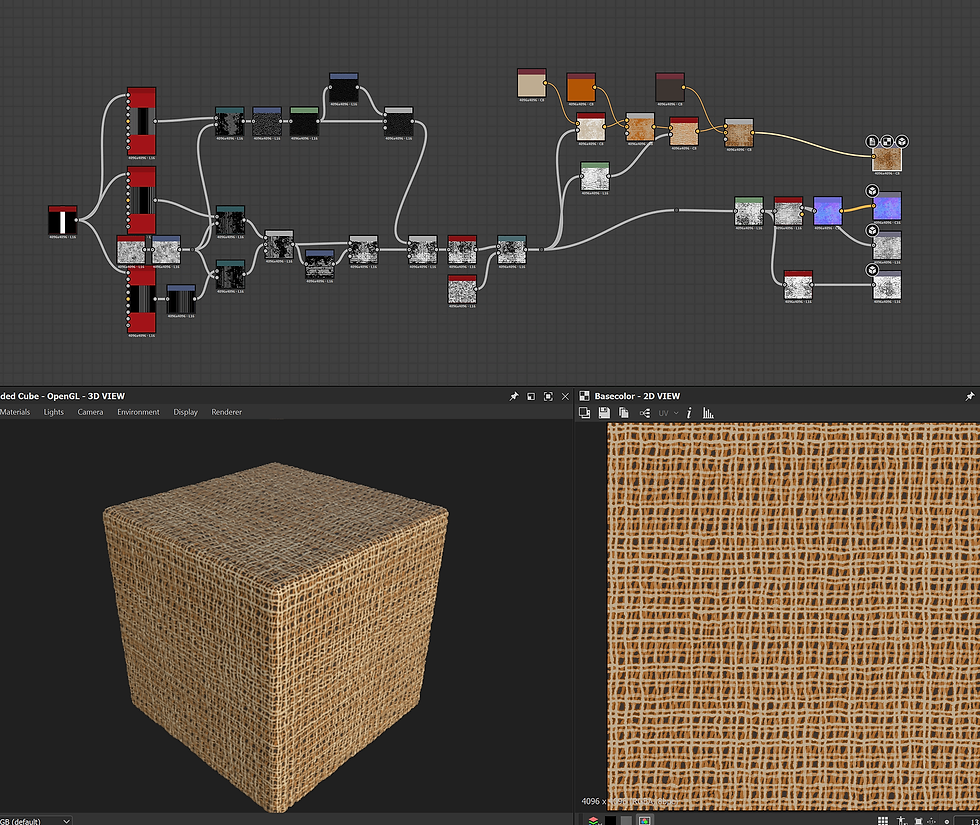
Anyhow, the modeling was breezy. Most things were simple cubes and ico spheres (I like the triangular look of ico spheres more than UV spheres). The limbs and antennae were done with the skin modifier. The decimate modifier is really useful for getting a more natural, random arrangement of polys for rocks and such.
After some quick unwrapping, it was time to texture. I haven't made/used pixel art textures before, but it really couldn't be simpler. I used a pixel art software I'd bought a while ago, called Aesprite. Many things looked fine with solid colors. Some just needed simple patterns, like dots or stripes. There were a few cases where the I had to be a bit more precise to match the textures to the shapes of the UV islands. This was easy enough to eyeball with some things, like wings, but others caused problems. The rind of the watermelon and crust of the bread had to match up pretty well, so I ended up using a trial and error system. Lots of importing and exporting until things were good. Of course, the day after the jam I noticed you can export your UV islands as images to overlay in your software of choice. Now I know.
I also made an animated texture of a mouth opening and closing for the bee model. It was meant to bee the narrator of the tutorial, but it was cut in favor of a hand drawn bee. That one's cuter anyway.
As for our main protagonist, he was mostly like any other bug. The legs are a few vertexes with a skin modifier, and the body and eyes are ico spheres. He does have one unique feature, though. His fluff was made using a technique that I have been fascinated with for years, since before I knew what it was or how games were made at all. I noticed it on several Wii games, such as Super Mario Galaxy. That hardware couldn't render hair in the way we do today. I used a trick that they used to get around that:
I duplicated and scaled up the body of Dad. I replaced the texture with a polka dot pattern with an alpha background. I duplicated and scaled up that sphere a handful of times. The result is a sort of fuzzy look that I personally love.
The next thing I did was the title screen. In my opinion, it's the highlight of the game. When I was asked to make it, I didn't have any ideas initially. After some brainstorming over a root beer float, however I settled on a classic heroic composition: a low angle of Dad atop a mountain of rocks and picnic food, powerful and imposing, contrasting his diminutive insect prey. Striking.
At this point I realized I would have plenty of extra time. We had discussed some cosmetic options, like alt colors. Then, in an incredible act of fate, I was hit with inspiration. At the dead of night, in the corner of the basement, I saw a tiny spider wearing a top hat. His sense of style was immaculate. I knew immediately that I needed to allow players' arachnids to don headgear. Each hour at precisely :39 and :57 he would return with a new piece. I studied and copied them faithfully and religiously. I knew I couldn't miss a single one.
When selecting a hat on the title screen, the angle and distance from Dad made it so that you couldn't see them, and couldn't make an informed decision between them. I asked Liam if there was any way to move the camera when selecting hats. He delivered. The camera sweeps quite satisfyingly to a close up whenever you pick one. We were all super happy with this.
Something seemed to be missing, so I tried running the game in unlit mode. I think it looked great. If we had time, I would've liked to cell-shade the game, but unlit was a good compromise. Unfortunately, I was overruled in this decision. The game was packaged in lit mode. Anyway, with five minutes before the deadline, I figured out how to set a taskbar icon for the game. I finished just in time.
We did ok in the jam ranking, which is fair. I'm mostly proud of my work. I don't think any of it is portfolio material, though. Low-poly doesn't pay the bills. If I could go back, I would fix a few things: Some of the models are smooth-shaded, which looks out-of-place. Similarly, the clouds are the UE default, so they look realistic and out-of-place. I would also cell-shade the game or make it unlit. Many lessons learned, much fun had. And now I can say that I have finish four games, one of which is titled Dad.
Play it here: https://studio-gomp.itch.io/dad


Comments